How Effective Are Vehicle Wraps?
There are dozens of advertising options these days, from search ads to billboards to radio space. What makes car, truck and van graphics a good marketing investment? Efficacy. Study after study shows the effectiveness of advertising via vehicle wraps, graphics, and decals.
A small sample of evidence:
- Vehicle advertising wins 30,000 – 70,000 impressions per day, according to the Transportation Advertising Council.
- Commuters can’t “turn off” vehicle graphics the way that they can with radio and television ads.
- Vehicle wraps and graphics are cost-effective. Assuming a full wrap costs $2,700, and you keep it on for four years, at 700,000 impressions per month in a major metro area, you’d be paying about $57 per month. There’s no way you can score that many impressions for such a low cost with other advertising mediums.
- 3M has stated that a company would need to spend $130,000 in traditional advertising to get the same impact as a $3,500 vehicle wrap.
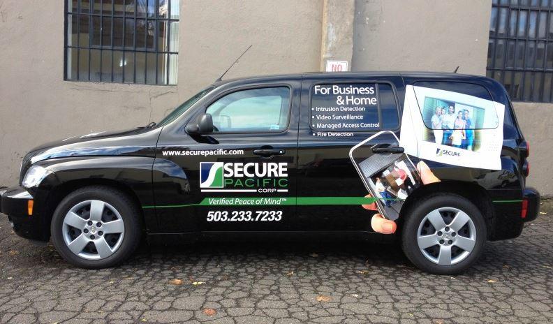
With all that said, many of the vehicle wraps we spot on the road are ineffective, not because they aren’t getting impressions, but because they’re poorly designed. For instance, a photograph may be the main focus of the graphic. Yes we all like to see smiling faces, but the commuter will probably remember the face and not your brand. Read on for some of our top tips on making your vehicle graphics effective.
Tips for Effective Vehicle Wrap Designs
Have a Strong Brand. Unless you have national brand recognition, building brand awareness is likely your number one goal with vehicle wraps and decals. And if your brand logo is vague, bland or otherwise unattractive, your vehicle graphics won’t have much impact. Our graphic designers are happy to provide feedback on your brand and whether it will garner the business you’re looking for.
Simple is Better. There’s plenty of visual candy competing for our eyeballs these days. Putting more words or pictures on your vehicle won’t capture drivers’ attention—indeed, it will probably cover up the real message you hope to get across. Stick with simple, clean visuals. Minimize excess verbiage. Bullet points are out. A phone number, a website, and an easy-to-read brand name are must-haves. A tagline is a good idea, too, but anything else should be considered noise. Remember, you may only have a couple of seconds to stick in a passing drivers’ visual memory. Too much information or too many pictures will only overwhelm.
Choose Contrasting Colors. Think back to your grade school lesson on the color wheel. Remember how contrasting were located opposite each other on the wheel? Those are the best color combinations for your vehicle graphics. Purple/yellow, blue/orange, red/green; these exact opposites make vehicle graphics stick out. Black/orange, red/white, and other non-exact opposites will also work, but you should avoid similar tones, such as red/magenta, as these will not provide the same visual “pop.”
If you’re not sure what you’re looking for, or you’d like some tips on turning your brand into an effective wrap or graphic, give us a call. Our graphic professionals are happy to help you find an effective way to advertise on your company’s vehicles and trailers. For instance, if you’re running a shorter marketing campaign, we know what kind of vinyl to use that will be easy to remove and lower in price. We can also design your graphic in-house, for the maximum impact and ROI.


