Color Contrast In Business Signs
When it comes to your company’s business signs, you know that no detail is trivial. Whether it’s the placement of a logo, the words used or the images displayed, outdoor signs for businesses carry a lot of weight in your branding.
This is why color theory is core to your marketing efforts. Color theory is the study of how colors can affect the way someone feels, and can help shape how the public perceives your brand.
The colors used in window signs for businesses and have real outcomes on interest in your company, and ultimately, sales.
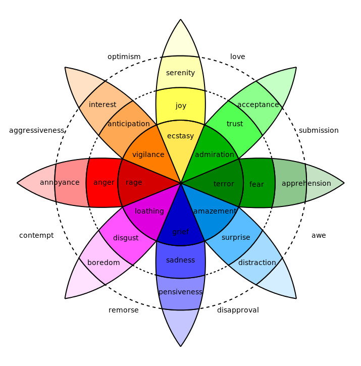
Here are the most common associations with each color according to color theory:

While Plutchik’s wheel offers helpful generalizations, it’s also important to consider your location and audience when planning your visual marketing efforts. For example, in some cultures, pink is associated with high status, meaning its use in materials could help elevate your brand’s prestige. In other cultures, however, it’s viewed as weak or childish.
How you use colors together also affects your marketing messages. Therefore, consider the role of color coordination in your marketing materials—it can help keep your designs balanced, and draw attention to elements (like a phone number) you’d like to emphasize. Studies have demonstrated that the best results come from picking combinations of the same base colors and using accent colors as contrast.
Our specialists and designers know how to best deploy color theory to meeting your marketing goals. If you’re in the market for custom signs, rest assured we will leave no detail to chance. Speak with a specialist about your next project.


